AXA UK — Partnerships
One system, many brands
Design Lead on AXA's partnerships portfolio, where I helped shape an atomic, token-driven design system that keeps multiple partner brands consistent, compliant and fast to ship.
- Role
- Design Lead
- Year
- 2025 — Present
- Focus
- Design systemsDesign tokensLeadershipWCAG
Overview
As Design Lead on the partnerships team, I help set design strategy across a portfolio of brands and products. The challenge is inherent to partnerships: every partner arrives with its own brand standards, and every product needs to feel native to that partner without rebuilding from scratch.
Our teams answer is an atomic, multi-brand design system built on design tokens. I was one of its main contributors, and a lot of it grew out of work I had already done — but it was created and developed with a team around it, not by one person. Brand layers sit on top of a shared core, so a new partnership becomes a theming exercise rather than a redesign — while accessibility and craft stay non-negotiable underneath.
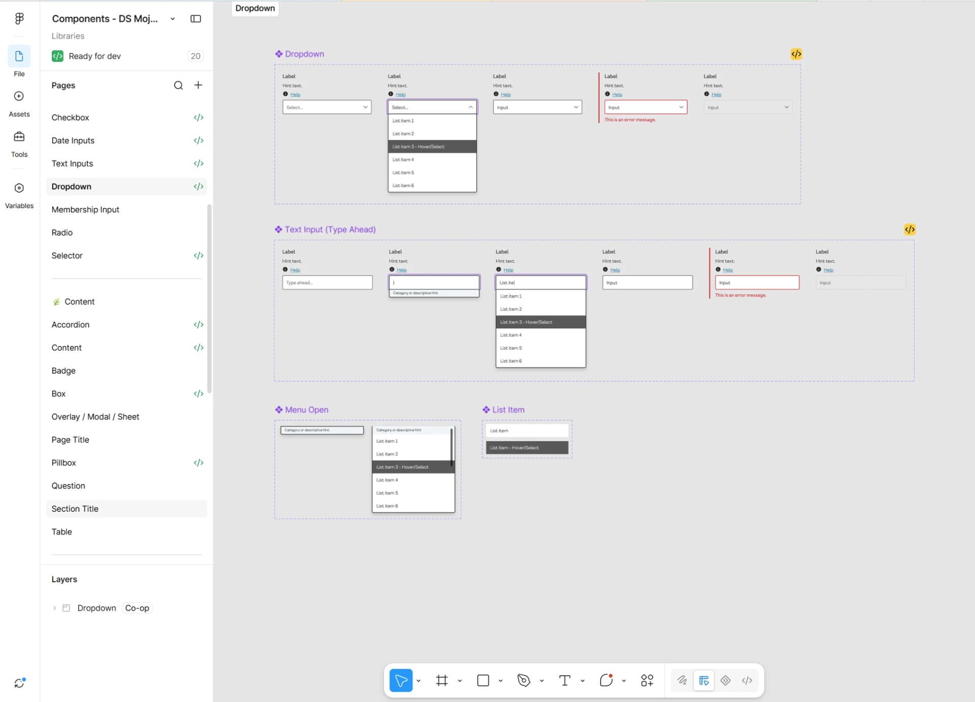
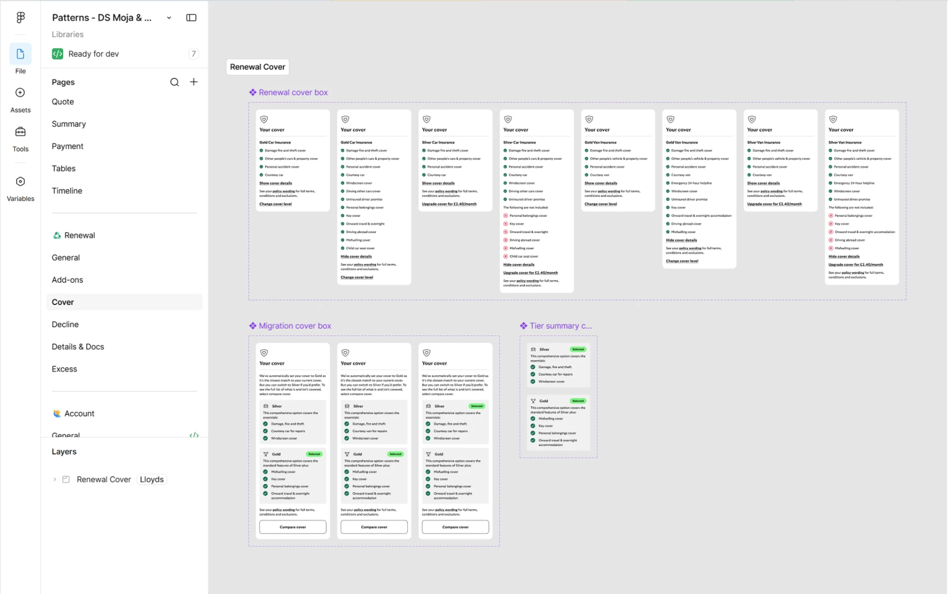
It didn't start from a blank page. Patterns and components first built for Moja, AXA's challenger brand, seeded this work, so the partnerships experience inherited journeys that had already been tested with customers. Extending design that already existed cut duplicated effort across the two brands and helped carry a successful pitch through into delivery.
The system has since gone further than the partnerships portfolio. Other brands across AXA are now moving onto the same foundation, consolidating their journeys so customers meet one consistent experience wherever they arrive from.
The challenge
Two things had to be solved at once. Partner brands each demand distinct visual identities, while the business needs consistency across the portfolio. And the system had to let us deliver multiple brands and products within the timescales we promised — efficiently, and future-proofed so further partnerships could be added without starting over.
Selected work
The approach
One foundation, many identities
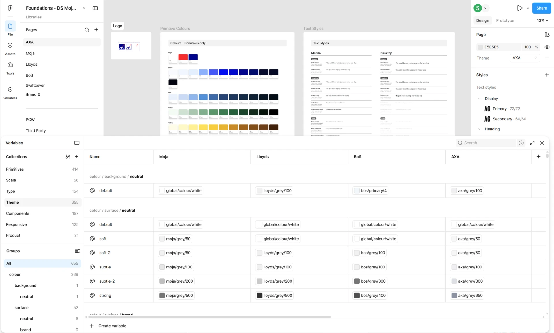
We set a common base for usability and interaction patterns, so a journey behaves the same way wherever it appears, while each partner keeps its own colour, type and character on top.
Tokens before components
We defined a token architecture first — core, semantic and brand tiers — so colour, type and spacing could be re-skinned per partner without touching component logic.
Approvals, moved earlier
We gave partners the component library first, so they could review and approve the building blocks before journeys were built end to end. Testing and sign-off shifted earlier in the process: the baseline of a journey was agreed up front, rather than waiting until it existed in its entirety.
From proposition to implementation
We connected the proposition work, the system itself and the build that follows it, so decisions made at concept level held all the way through to shipped product — and the experience could scale past any single journey.
Advocacy in the room
As one of the main design voices in internal and external stakeholder meetings, I helped align visual direction with commercial KPIs and company OKRs — making the system a business asset, not just a design tool.
The outcome
Multi-brand
One shared system
WCAG AA
Built into the core
Portfolio-wide
Design strategy, shaped with the team
- Design consistency across the partnerships portfolio, with partner brand standards preserved.
- New partnerships onboard through theming rather than redesign, cutting delivery effort significantly.
- Patterns and components first built for Moja now inform the wider partnerships experience — less duplicated work, and a more consistent experience across brands.
- Design that already existed proved its commercial value a second time: the same foundation helped carry a winning pitch into live partnership delivery.
- Delivery and sign-off with partner brands got faster — with the component library approved first, journeys started from an agreed baseline instead of a full build.
- Positive relationships with senior stakeholders and delivery teams, so design decisions and outcomes carried confidence through to delivery.
- The system is now spreading beyond partnerships — other brands across AXA are adopting it, consolidating their journeys onto one foundation.
- Design now has a seat at commercial conversations — visual direction is explicitly tied to KPIs and OKRs.
- Built and developed by a team across design and delivery — which is why the system has kept evolving well beyond the journeys it started with.